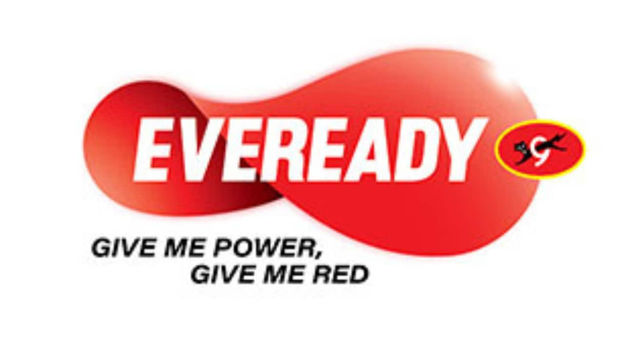
Eveready Industries India Ltd unveils its new brand logo. The ‘Eveready’ logotype held within the Red Ellipse or a ‘disc power button’ brought together the typeface and the Cat-o-9 reflecting strong cues of energy and authority. Drawing from the brand’s inherent association of ‘power/energy’ a contemporary new identity has been created signaling infinite possibilities and transformation towards a future committed to innovation, vibrancy, modernity, trust and empathy.
While retaining the ‘Cat-O-9’ unit which has been a defining image of the brand, the revamped Eveready logo marks a strategic drive; it derives its inspiration from the loop of infinity. It becomes fluid, animated and dynamic, symbolizing endless source of power and energy. It is marked by intentional asymmetry; the left side is slightly smaller than the right. The design is denotative of progress – from uncertainty to empowerment. This transformation bespeaks a future-ready, self-aware brand. The tagline ‘Give Me Power. Give Me Red.’ reinforces Eveready’s identity as an unwavering source of strength and resilience.
Speaking about the rebranding, Anirban Banerjee, Sr. Vice President & SBU Head (Batteries & Flashlights) of Eveready Industries India Ltd. said, “ The iconic Eveready brand has enhanced its respect, reach and recall over time, matching its products and quality with the best in the world. With evolving consumer needs, the brand needed to transform and expand its portfolio, offering powerful, premium and innovative products. It was thus important for the brand to be seen as relevant and contemporary across age groups in the new world as it straddled the new portfolios.
What happens when you pass energy through the Eveready disc? It starts to move and gather momentum. As the pace of the spin increases, the moving shape assumes the form of an infinity symbol. The new logo in motion stands for the brand’s vision of limitless progress and infinite power.” added, Mr. Banerjee.
“Eveready stands for limitless power and dynamic possibilities. It is ever evolving, constantly changing and forever transforming to keep India moving towards exponential progress. This zest for dynamism, infinite energy and endless possibilities finds form in the newly revamped Eveready logo. The new logo is a symbol of power without a pause. Revamped and animated, it evokes the idea of momentum, forever on the go. It forms the loop of infinity, to denote eternal drive, the spark of new beginnings. That’s why the latest rendition of the logo comes with an additional line: give me power. Eveready is the future of power. Infinity is the soul of new Eveready.”, said Sukesh Nayak, CCO, Ogilvy India.
