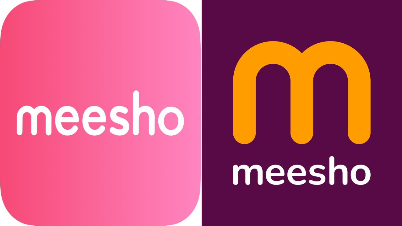
E-commerce firm Meesho has undergone a complete brand makeover. The company has launched a refreshed logo and new sonic branding. The idea is to solidify Meesho’s presence as a marketplace that sells value-first products across brand categories, making it more inclusive and affordable for all.
In March 2022, Storyboard18 wrote about Meesho’s possible brand revamp, highlighting how the company is planning to move towards a more unisex brand presence. Meesho’s current logo is the company’s name in pink letters against a white background – possibly a nod to its primarily female customer base.
Read More: Storyboard18 | How should Meesho attempt its brand revamp?
A year later, the company has indeed done that. Meesho has moved towards a new color palette featuring hues of ‘Jamuni’ (purple) and ‘Aam’ (mango yellow). The company said that the new colour palette encapsulates the vibrancy and grandeur of India’s diversity. According to colour theory, Jamuni is associated with aspiration, while Aam is seen as inviting and welcoming. The refreshed color palette aims to evoke personality traits of confidence and approachability among Meesho consumers and sellers. However, the logo retains Meesho’s ‘M’, albeit in a more colorful and interconnected avatar – which has been associated with the brand since its inception in 2015.
Vidit Aatrey, founder & CEO of Meesho, said that there is an enormous opportunity for mass adoption of e-commerce in India, and the next wave of growth will come from making it pertinent for all shoppers. “With this brand revamp, Meesho will progress further on its journey to become the go-to e-commerce platform for the next billion consumers in India,” he adds.
Building scale, fuelling aspirations
Megha Agarwal, CXO of user growth at Meesho, in an interview with Storyboard18, says that the company has expanded multifold since its launch eight years ago when it was largely focused on fashion.
“Now, we have entered into multiple categories such as home, kitchen, beauty, personal care, toys, or consumer electronics. So, we wanted to ensure that our refreshed brand identity is actually able to bring that essence out as well. We have scaled massively in those eight years, and we wanted a brand identity that is true to our current scale and to our future aspirations as well,” she notes.
Meesho has scaled over the years. Recently, it has emerged as the world’s fastest shopping app to cross 500 million cumulative downloads across Google Play and the iOS App Store combined, reaching this milestone in six years, according to data.ai (formerly App Annie), the mobile data analytics provider. The company says that it has 140 million annual transacting users, 1.1 million sellers, and approximately 100 million active product listings across 30 categories.
Apart from its refreshed logo, Meesho has also launched new sonic branding with the tagline “Lo aaya Meesho” (Here comes Meesho). Again, the idea is to emphasise that Meesho solves multiple consumer needs beyond fashion. The aim is to increase the brand recall of the platform among consumers.
“The new sonic identity is to ensure that we talk in a very aspirational way while ensuring that our friendliness, approachability, or warmth as a brand does not go away. Therefore, in our marketing campaigns, we are going to ensure that the tone of voice that we are going to take is going to be a balanced mixture of being aspirational yet approachable,” Agarwal explains.
Meesho is all set to launch a new campaign in the first week of July.
Lulu Raghavan, managing director of Landor & Fitch, who has worked on Meesho’s brand revamp, says that every design decision was evaluated from a consumer lens to arrive at a refreshed brand identity that signals the joy that consumers experience when interacting with the brand Meesho.
Expert speak
Design and brand expert Shekhar Badve, founder director of Lokusdesign, agrees that Meesho needed a more unisex brand identity, and the brand revamp is a good change.
“It’s a great jump from the earlier identity and colors. The new set of bold flat colors and high contrast vibes with their target group well. It makes the brand look young, vibrant, and fun. The ‘m’ symbol in the logo is a great addition to make the identity flexible and adaptable to various digital formats and applications,” he adds.
Badve is quick to point out that the ‘m’ tilts towards food or food delivery brands, but its presence can’t be missed.
“Meesho logotype in lowercase also makes it friendly and approachable as well,” he highlights.
Badve also lauds the addition of sonic branding since it always helps with recall and acts as a subliminal hook.
“Especially in a cluttered market and greatly divided mind space. Taglines if crafted well have a great impact on delivering the brand or corporate message and additionally create recall,” he concludes.
According to a RedSeer report commissioned by Snapdeal in August 2021, the number of value shoppers is expected to triple, from approximately 78 million in 2021 to nearly 256 million by 2026. Clearly, Meesho’s ambition is to grab a bigger share of this market. It would be interesting to see how a brand new avatar of Meesho will help tackle competition from bigger players such as Flipkart and Amazon.
