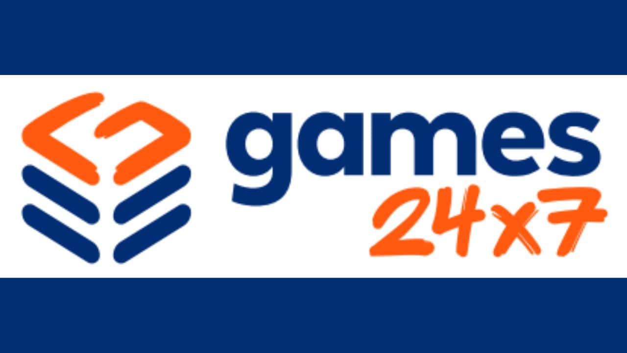
Games24x7, an online skill gaming company, unveiled its new brand identity, marking a milestone in the company’s 17-year journey. It is guided by the operating ethos of ‘Science of Gaming’.
At the unveiling of the new brand identity, Bhavin Pandya, co-founder and co-CEO, Games24x7 said, “At Games24x7, our path has been shaped by an unwavering dedication to a scientific mindset, our focus on user-centricity, and our incredible teams that wholeheartedly embrace this scientific approach. Our fresh brand identity goes beyond mere visual change; it stands as a reflection of our profound enthusiasm for these core principles and the continuous advancement within the online gaming sector. The rejuvenated brand identity underscores our technological expertise and commitment to harnessing cutting-edge technologies like AI/ML to create hyper-personalized gaming experiences to entertain our users.”
Every element has been designed to communicate the duality inherent in brand’s guiding belief: the intersection of science and entertainment.
Brand initiatives around new visual identity launch:
Games24x7 sparked excitement surrounding its new visual identity by unveiling a colour teaser on its social media platforms. The video showcased waves of vibrant colours, each inspired by the brand’s new logo. Subsequently, to provide the audience with a deeper insight into Games24x7’s journey and story so far, its values, and commitment, the brand presented in a three-part illustrated video of Games24x7 journey.
The brand engaged its employees through a microsite – Readytogo24x7.com, which featured a live countdown to the unveil, one-touch games with exciting rewards, and a live photo wall encouraging employees to share their photos, fostering a visual representation of the Games24x7 extended family.
Contests were also designed, inviting employees to share their unique perspectives and experiences with the brand, adding a fun and personal touch to the rebranding activities. Furthermore, employees expressed their connection with Games24x7 by sharing the brand’s values that resonate with them the most on their social media handles. These initiatives not only built anticipation but also created an inclusive and spirited atmosphere, allowing teams to actively participate in this journey.
Key elements of the new logo:
The new visual identity features a stack of ‘G’ letterforms, with the vibrant orange brushstroke ‘G’ proudly positioned atop a solid navy stack. This distinctive symbol not only represents the initial letter of the company’s name but also signifies the commitment to a scientific approach in crafting enjoyable gaming experiences. The coding symbol in navy blue, denoting the universal language of technology, further reinforces the company’s commitment to innovation, while the depth of the stack cues metaphorically illustrates the organization’s willingness to delve deep to address challenges at their core for game development.
The logotype ‘games24x7’ utilizes two distinct typefaces, Poppins and Sprite Graffiti. ‘games’ is crafted with the bold, geometric forms of Poppins, representing the precision involved in the science of gaming. In contrast, ’24×7′ utilizes the energetic, brush script numerals of Sprite Graffiti, embodying the vibrant and playful nature of the gaming experiences Games24x7 creates.
The new visual brand identity can be seen across all brand communications, social media platforms, the website, and other collaterals.
