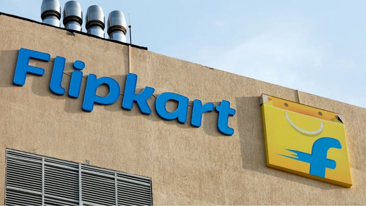
Walmart-owned Flipkart has undergone a significant brand refresh, unveiling a new logo and an updated homepage as part of its strategy to appeal to a younger audience and strengthen its position in the rapidly expanding quick commerce sector.
At 17 years old, Flipkart has not updated its logo since 2015, a move aimed at appealing to mobile-first users.
However, with customer demographics shifting and younger consumers increasingly shifting their purchases to quick commerce platforms, the company has now refreshed its image to maintain its competitive edge.
While retaining its original color palette of yellow and blue, Flipkart has opted for a subtle shift in shades. The new logo, which no longer includes the full “Flipkart” name, now prominently features just the brand’s initials, “f,” signalling a streamlined and modern look.
This design choice aligns with Flipkart’s goal of appealing to a broad range of customers, particularly Gen Z, whose shopping habits are evolving toward faster, more immediate solutions.
This brand overhaul coincides with Flipkart’s recent foray into the quick commerce space with the launch of Flipkart Minutes, an initiative aimed at providing rapid delivery of essentials.
The quick commerce market in India has grown from a luxury to an essential service, with consumers seeking delivery in minutes rather than hours. Flipkart’s entry into this space was in response to growing competition from rivals like Zomato’s Blinkit, Swiggy Instamart, Zepto, and Tata BigBasket.
