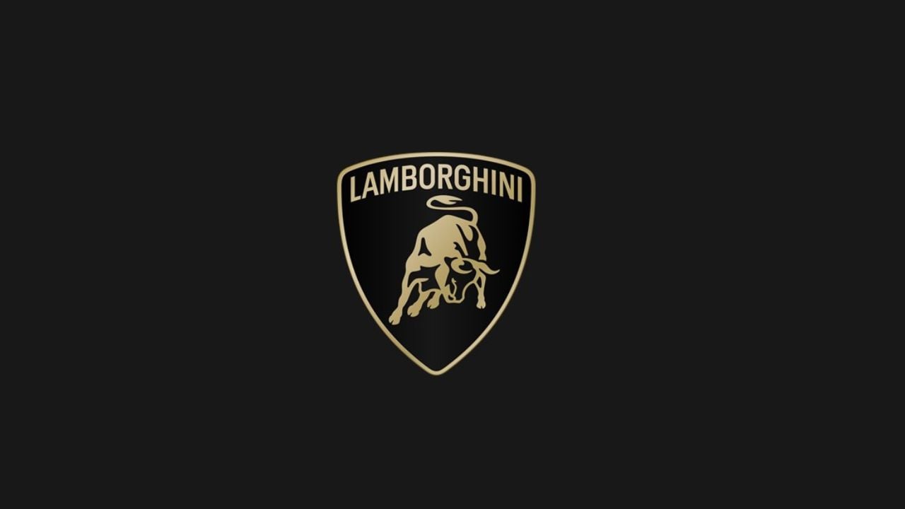
After more than two decades since the last update, Automobili Lamborghini has renewed its logo. The restyling is driven by a new strategy that involves adapting the brand’s visual expression to better reflect the “brave”, “unexpected” and “authentic” values of its mission, namely “Driving Humans Beyond”, a concept that translates into the intention to always go beyond the limits, standards and conventions.
This evolution is part of the broad transformation process denoted Direzione Cor Tauri, the strategy that embodies Lamborghini’s new trajectory focused on sustainability and decarbonization.
With this in mind, the House of Sant’Agata Bolognese is implementing changes that involve not only the cars, but the corporate identity as a whole, thus impacting the company’s culture and values, which will also see a new expression in terms of all the visual aspects.
The new logo, unveiled and used on all the company’s official channels, is redefined by a broader Lamborghini typeface than its predecessor and by colors that are minimal yet bold. Therefore, black and white are reconfirmed as the primary hues, symbolizing the clear identity of the brand, while yellow, along with the introduction of the gold color, is used as the accent color.
This revamped version of the logo becomes an integral part of the company’s distinctive identity and will also be applied on future cars. In addition, the bull in the center of the logo has undergone a major transformation. For the first time, it will exist individually on the company’s digital touchpoints, separated from the classic shield to lend it even greater prominence.
But the change also extends to all manifestations of the brand. An official Automobili Lamborghini typeface has been created that echoes the lines and angularity of the cars, in line with the style and design of the Sant’Agata Bolognese-based company, and it will be used for the company’s communications. The redesign also includes a new set of icons, developed in collaboration with Lamborghini Centro Stile, that for the first time will be used and shared uniformly across all the digital touchpoints.
Read More: DELL ranks first in India’s 1000 most trusted brands fifth year in a row: Report
