After maintaining a steady growth rate of 10% over the past few years, Dinshaw’s is now aiming to accelerate its trajectory, targeting a 25% growth in FY26. “The long-term vision is to grow at a CAGR of at least 20%,” says Zervin Rana, Director at Dinshaw’s Dairy Foods, underscoring the company’s intent to scale sustainably while enhancing brand equity.
A big part of that push is coming from a renewed retail strategy and brand overhaul. While Dinshaw’s continues to build on its strong presence across multiple Indian states, including Maharashtra, Madhya Pradesh, Chhattisgarh, and West Bengal, Rana emphasises that the brand’s focus isn’t just on expanding into new territories but on deepening market share in existing ones. “More than territory expansion, we value market share expansion in each market. This has a direct impact on brand equity and profitability,” he shares with Storyboard18.
The company is doubling down on physical retail, planning to add over 6,000 new outlets and about 20–30 parlours across India this year. This builds on Dinshaw’s already robust network of 45,000 retail points and around 100 parlours.
However, he acknowledges that the parlour model may not be as central to growth for many, going forward. “Ice cream parlours are on a decline—high rentals and the rise of quick commerce are major factors. Rents in tier-1 and 2 cities are a killing factor for parlours decline. In small up-country markets, rents are reasonable, and business is good from parlours. Hence most expansions (for Dinshaw’s) will continue happening in smaller tier-3 markets,” he explains.
That said, quick commerce is also a growth lever for Dinshaw’s. “Quick commerce will emerge as a significant sales avenue,” he says, adding, “though for mass brands, maintaining profitability in this model will be a challenge.” Currently, 99% of Dinshaw’s ice cream sales are offline, but the company expects digital channels to contribute at least 10% to total revenues within the next two years.
Alongside distribution, Dinshaw’s has simplified its product portfolio, eliminating sub-brands (except for milk variants) to bring clarity and cohesion across categories like ice creams, dairy, bakery, and namkeen. “All categories have enough scope for growth,” says Rana, who is confident that the company can maintain 15–20% growth across segments.
Summer ready with a fresh scoop of identity
For a brand that has been part of Indian summers since 1932, the challenge wasn’t in the product – it was in perception. “Great product, but low brand equity,” as Rana puts it. That was the starting point for Dinshaw’s comprehensive brand refresh, which the company rolled out this March, just ahead of peak ice cream season.
The legacy brand has unveiled a bold new identity across touchpoints – from retail signage and digital assets to product packaging and staff uniforms. This revamp, which has been 18 months in the making, was driven by a realisation that the brand needed to stay relevant in a fast-evolving consumer landscape. “There is no ideal timeline,” remarks Rana. “But once you feel you’re falling behind, it’s time to act. You have to remain relevant at all times.”
To spearhead this transformation, he brought on board seasoned brand strategist Malvika Mehra as Creative Head, Marketing. Together with agency partners and internal teams, the duo embarked on a deep-dive reassessment of everything—from product formulation and design to communication and brand architecture.
“Dinshaw’s is truly an innovative brand with delightful products that could beat the best in a blind test,” says Mehra, adding, “but brand equity had been neglected.”
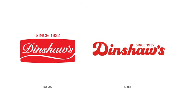
The redesign began with the logo – a tricky task given that the original was the signature of the founder, Mr. Dinshaw Rana. “Without losing authenticity and legacy, the brief was to make the new logo relevant for 2025 and beyond,” she explains. The solution? A bold red ‘D’—striking, symbolic, and instantly recognisable. “In today’s digital landscape with zero attention spans, the ‘D’ is a powerful mnemonic across social media, packaging, and more.”
The design was executed by NH1 Design. “We did an online scan of work credentials of about eight- ten design firms, met with only three, and finally selected NH1 Design,” shares Mehra.
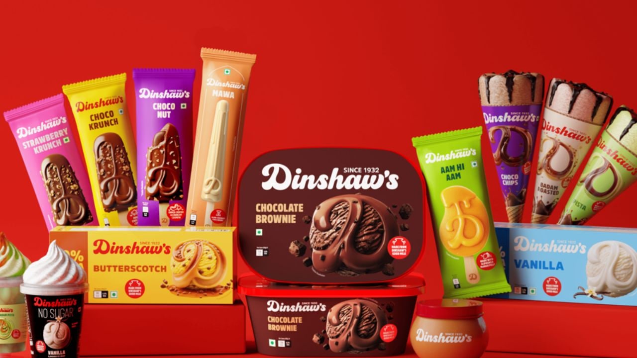
While the logo underwent an evolution, the packaging saw a full-blown revolution. “Our earlier portfolio was crowded with too many sub-brands, each cut by price, audience, or format,” highlights Rana. “Limited freezer space and budgets made it hard to support them all.” So Dinshaw’s simplified its brand architecture, phasing out sub-brands (except for milk) and creating a unified identity. “We now have a clean, impactful design system anchored by the ‘D’,” Mehra adds.
The results are already visible across Dinshaw’s four core categories—ice creams, dairy, bakery, and namkeen. The design cues vary by category but are unified in their visual language, making the brand instantly recognisable in retail environments. From staff uniforms to shop fronts, every touchpoint now reflects the new identity.
Additionally, a new brand film (with agency partner Womb) is set to roll out by mid-April, supported by a multi-channel marketing blitz across digital, print, OOH, and point-of-sale.