Advertisements have always been a great way for brands to market their products and services. However, it has always been a hit or miss situation. Not all brands come up with great advertisements. Some have positive lasting impacts and some we would just love to forget. Storyboard18’s weekly ad reviews filter through the past weeks ads, letting you know which ones were the best and which ones weren’t quite up to mark. We provide you with completely unbiased and unfiltered opinions that are fun to read and paint a clear picture. Read on to find out which ads were in our professional opinions, MAST and which were MEH in this week’s Mast & Meh.
MAST
Brand – Dhara | #KhaanePeKehna
Agency – DDB Mudra
This Diwali commercial brings in a different flavour. It might make some a bit uncomfortable and awkward, while some may even relate to it deeply. Dhara highlights a cultural practice that it thinks can be rethought by its consumers. Over the years, the iconic cooking oil has been winning hearts with jalebis and now with gulab jamuns, as centrepieces of its storyboard. It’s topical, real, and adds the right amount of sweetness to our Diwali ad playlist.
MEH
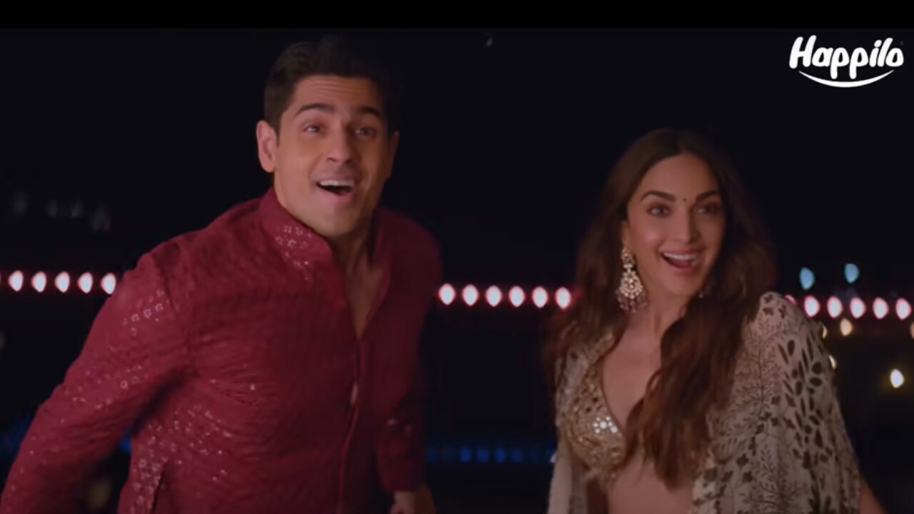
Brand – Happilo | #KholoKhaloHappilo
Agency – McCann Bangalore
We are glad this is just a 30-second commercial! This film could have been for an energy drink brand, a pair of headphones or even pan masala. It’s easily interchangeable. Actors Sidharth Malhotra, Kiara Advani could have also been replaced by anyone in the film. We would skip the ad because it is generic. Also, because we were bored just like Malhotra, and Advani, after watching it.
MAST
Brand – Costa Coffee
Creator – PotatoFace (Christina Furtado)
From cleaning the house to preparing yummy snacks for guests, Costa Coffee’s cute animation series for Diwali takes us back to the joy of preparing and celebrating Diwali with loved ones. Diwali preparations start weeks before of the festival and that’s what the campaign creatively captures. The brand has collaborated with illustrator and animator Christina Furtado (known as PotatoFace on Instagram) who has designed the campaign. This one stands out for its simplicity and relatability. A definite Mast in our books.
MEH
Brand – Niva Bupa Health Insurance
Agency – Leo Burnett
The new Diwali campaign has its heart in place with a simple premise of a young man looking for a special Diwali gift for his parents after securing his first job. He is seen consulting with his friends and eventually ends up deciding to buy health insurance for his aging parents. But the plot and execution is often repeated in the health insurance category and this does not help in brand recall at all. The ad looks like any other health insurance spot with a Diwali theme. It’s likely to get lost in the Diwali advertising clutter.
MAST
Brand – Sabhyata
Campaign – #RedefiningCelebration
Production House – P Se Picture
In February, the government introduced the Maternity Benefit Act that increased the number of leaves for pregnant women from 12 weeks to 26 weeks. The bill’s main intention was to motivate the female workforce to continue their work post the birth of their child. But, what serves as a major impediment in the lives of the female workforce is how the corporate world perceives motherhood and how they become dispensable despite having the calibre. Sabhyata captures and elaborates on this very challenge in its recent campaign.
A would-be mother who is on her notice period, has applied for a new role in another organisation. She has a conversation with a lady, unaware that she is the CEO of the company. The conversation sheds light on the concept of quiet firing. The commercial raises its bar through realistic storytelling, coupled with a soulful song. An important issue conveyed and executed beautifully. A stand-out campaign in this Diwali ad clutter.
MEH
Brand – Sebamed
Campaign – ‘Sebamed baby- Jab skin ho paper thin’
Agency – The Womb
A decade or more ago, the Johnson & Johnson baby oil ‘Pehla Kadam’, which was one of the longest running commercials, witnessed a toddler taking his first steps. It made its way straight to our hearts. However, Sebamed’s recent campaign doesn’t really make the cut. As the commercial rolled, it felt more and more incomplete and we were left wanting to know more. The ad had a good start but lost its way towards the end as it cut to a listing of the brand’s features in a formatted style. The ad follows the same boring story format that we have come to expect from those that feature baby products. A more insightful and thought-provoking storyline could have prevented a meh. Brands and agencies really need to rethink what works in modern times for the modern consumer.
